Richard Caladine Explores the Use of Colour, Depth of Field and Perspective
(first published in Photo Review magazine Dec/Jan 2005)
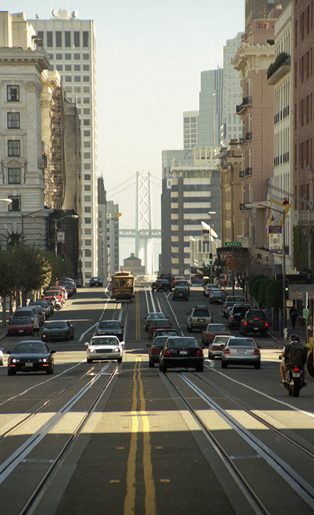
It takes more than correct exposure and focus to make a photograph that is pleasing to the eye. Good photographs usually adhere to a number of compositional conventions and display good use of the visual tools available to the photographer. Three of these tools are colour, depth of field and perspective. But first a word of warning: the purpose of a photograph can be described as the portrayal of a three dimensional object on a two dimensional surface, and visual perspective can be used to imply the third dimension. Perspective is based on the incontrovertible perception that things appear smaller as they get further away and parallel lines appear to converge. Parallel lines meet at a vanishing point which is often on the horizon.
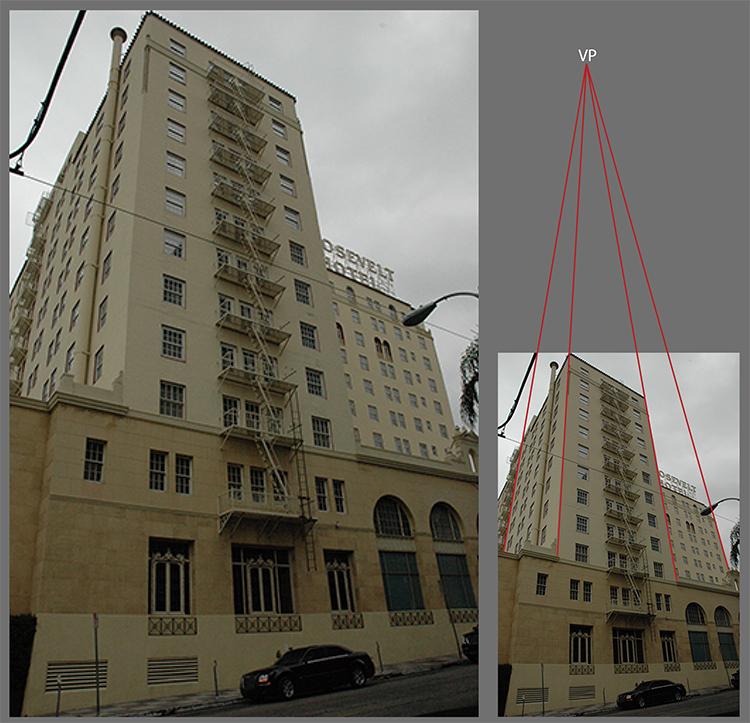
Vanishing points and deep perspective draw viewers’ eyes into the image and reinforce that the subject is three-dimensional. Vanishing points can be central, off to the sides or in the case of converging verticals above or below.
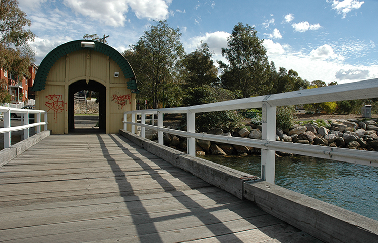
Leading lines can be any line in a photo- graph. They are often lines of perspective that draw viewers’ eyes to the subject or simply provide an easy and logical pathway for their eyes through the image. When lines of perspective are used as leading lines the visual pathway emulates the visual scanning of the three dimensional subject. Some photographers go to a lot of trouble to ‘correct’ perspective in programs such as Photoshop or Paint Shop Pro. However, there can be confusion between the distortion caused by some wide angle lenses and perspective. This confusion often results from differences between the way an object can appear and its known shape. Consider a photograph taken from the corner of a square building, of which two of the walls are visible. The walls appear to get smaller as they recede into the distance, yet we know that the walls are square. lf the perspective of the photograph is ‘corrected’ to make the walls square, the result could be an image of an impossible object. The bottom line is that the photograph should look right to the photographer or the intended viewer.
Another tool that can be used to indicate the third dimension in a two dimensional image is aerial or atmospheric perspective. For many photographic purposes we assume that the air is completely transparent. However for subjects at great distances from the camera, the assumption of transparency fails because the air contains fine particles of water vapour, dust and other pollutants that change the course of the light passing through it. The effects of atmospheric perspective are proportional to the distance from the camera to subject and are generally a reduction in contrast, an increase in brightness and desaturation of colour.
ln Australia atmospheric perspective is often characterised by blue haze caused by the presence of fine particles of eucalyptus oil in the air. Thus, blue haze on distant subjects can impart an Australian look to an image. We live in a world of colour, and colour photography has displaced black and white photography as the preference of the general population. Black and white has not disappeared completely; it has a role in some areas like portraiture and is sometimes used for artistic impact. Much has been written on the theory of colour but there are a few points about colour that provide an introduction to this complex topic.
Have you ever wondered why stop lights are red and Go lights, green? Likewise, why are most warning signs in red and or yellow? Warm, saturated colours like strong reds and yellows jump out to meet the eye and are called advancing colours. Conversely cool colours like green and blue tend to stand back visually and are called retreating colours. For this reason a small area of an advancing colour (e.g. red or yellow) against a background of a retreating colour (e.g. green or blue) tends to attract the viewers’ eye.
Putting different colours together in an image can have differing effects. Some colours when placed together harmonise visually while others appear to emphasise each other or ‘zing’. If the colours of the rainbow are arranged around a circle, adjacent colours tend to harmonise while opposites ‘zing’.
THE FINAL DECISION OF WHETHER A PHOTOGRAPH IS PLEASING TO THE EYE HAS TO BE MADE BY THE OWNER OF THE EYE WE ARE SETTING OUT TO PLEASE!
While depth of field is possibly one of the more difficult aspects of photography to understand, it has a huge potential for creating images that are pleasing to the eye. When a camera is focused on a subject there is a zone in front of and behind the subject in which things are acceptably sharp. For large apertures this zone is small and, for some lenses and settings, can be less than a millimetre either side of the subject. For small apertures this zone, or depth of field, can be quite large.
To increase depth of field, use a smaller aperture (larger f-number); to reduce depth of field a larger aperture (smaller f-number) is required. This can be easily achieved through equivalence of exposure (also known as the law of reciprocity). For example the exposure 1/60th of a second at an aperture of f4 is equivalent to 1/30th of a second at f5.6. ln most good cameras a depth of field preview button allows the photographer to see what is in focus prior to exposure.


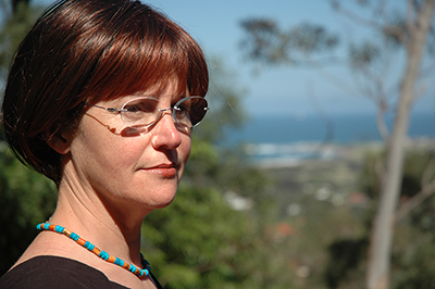
Depth of field allows the photographer to choose the elements of the image that are in focus. A classic example is selective focus in portraiture where the convention is to ensure an out-of-focus background, which draws the viewers’ eye to the in-focus subject. However, the final decision is an aesthetic one and the decision to keep the background in focus or out of focus can be determined by other factors. One factor can be whether the photographer wishes to depict the subject in its environment or not. Selective focus with some digital cameras can be difficult as cameras with small imaging chips produce inherently large depths of field.
THE BOTTOM LINE IS THAT THE PHOTOGRAPH SHOULD LOOK RIGHT TO THE PHOTOGRAPHER OR THE INTENDED VIEWER.
The ‘rules’ of perspective, colour and depth of field are not definitive and the final decision of whether a photograph is pleasing to the eye has to be made by the owner of the eye we are setting out to please! Experimenting with these tools and intentionally breaking the ‘rules’ or conventions is one way in which photographers can sharpen their skills and produce great photographs.
Richard Caladine is the coordinator of
Learning, Innovation and Future Technologies(LIFT) program at the
Centre for Educational Development and Interactive Resources (CEDIR),
University of Wollongong.
